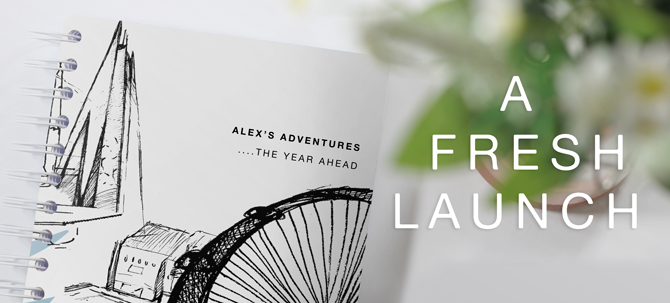

As you may have seen on our social media lately - we’re a buzz with new releases long awaited on the TOAD Designer. There’s a lot to shout about for us this April, not only are we debuting at London Stationery on the 26th and 27th April, we’re also launching a whole host of new specially designed TOAD products, a brand new website, launch of TOAD’s very own Personal Organiser equipped with magnetic features.Yes magnetic.
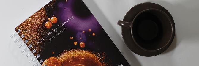
However in the spotlight is one of our latest projects by the in house design team at TOAD, the launch of five new cover designs and the long awaited launch of hardback complimenting TOAD Diaries date - flexible method. Our team has been brimming with ideas since last September and thus a brilliant influx of designs has come through ready for a spring refresh and ready to launch as we step up to London Stationery Show. These five designs include, Molton, CityScape, Monsters, Minimal and PaperTown. Speaking to our design team we’ve got three mini interviews from each creator on what inspired them and how they came to their designs
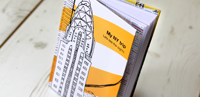
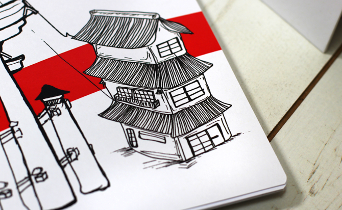
CityScape - Emily Nuttall
What was your initial inspiration?
"My initial inspiration came from the illustration from London Olympics 2012 and first London was drawn it felt natural to try other well known cityscapes. The colours came after as an afterthought when editing but it adds a character and a striking depth into the design, I really like it."
Who is your target audience?
"A mixture of male and female, however predominately females as this tends to be the majority in the stationery ‘world’ "
Tell us about your love for creating new artwork and designs
"My illustrative style is very loose and quick lines but detailed with a hope to capture the character of the object so hopefully more of that to come in other cover designs!"
Your favourite cover design and why
"My favourite is probably London, as it is the most intricate and specifically the Houses of Parliament as it was very interesting to draw and you can appreciate the detail of the building when you study it up close"
So what's next in your plans
"Developing my children’s books, working and learning about marketing and hopefully watching TOAD grow into something amazing!"
Molton and PaperTown - Kerrie Freeman
"'Molten' is a range of photographic designs, which explores the creative interaction between calligraphy ink, oil and soap. Inspired by the works of the artist, Rus Khasanov and Sky's most recent ad campaign - Fluid TV, the molten range conveys a classic look with a complementary mix of sans serif and serif personalisation. With aesthetically pleasing detail and diverse colour choices, the molten range aims to intrigue customers of all ages and genders to embrace their creativeness with a touch of luxury/class. Inferno - meaning a large fire that has become out of control is a representation of my favourite design from the ‘Molten’ range as the analogy of the gold glitter spreading across the black/red ink mimics a fire like formation. Within the design, a mystical dragon like figure has formed as the ink and oil have reacted.
My love for design all originates from the well known artists such as Banksy, Tim Marrs, Kate Moross and David Carson. I try to look for inspiration in all kinds of manners, whether it be online, a magazine, walking down a street or even listening to music. Future possible cover design plans will look at the use of typography and how this can be used alongside subtle illustrations or just simple montages of type, influenced by the 36-day alphabet challenge. I also plan to return back to the university of Huddersfield at then end of my placement year at TOAD Diaires to finish my degree in Graphic Design and pursue a career in what I love."
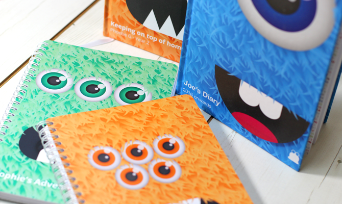
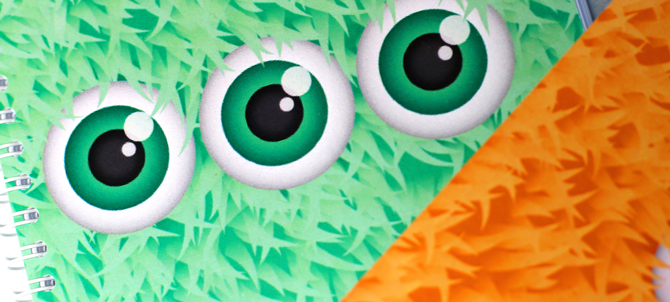
Monsters - Sophie Gill
"I wanted to create a range of covers that were aimed at children and families, I wanted them to be colourful and fun and something every child loves. The monsters were really fun to make and they are full of character, each one has a different set of characteristics which offers a variety of choices to the customer. My favourite is probably the blue monster, he’s just so happy and cheeky looking. "
Find out more at https://www.toaddiaries.co.uk/